Posted by Laurence Moroney, Developer Advocate
With Google Play services 8.3, we’ve been hard at work to provide a greatly improved sign-in experience for developers that want to build apps that sign their users in with Google. To help you better understand some of these changes, this is the first in a series of blog posts about what’s available to you as a developer. In this post, we’ll discuss the changes to the user experience, and how you can use them in your app, as well as updates to the API to make coding Sign-In with Google more straightforward. On Android Marshmallow, this new Sign-In API has removed any requirement for device permissions, so there is no need to request runtime access to the accounts on the device, as was the case with the old API.
User Experience Improvements
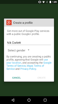
We’ve gotten lots of feedback from developers about the user experience of using Google’s social sign-in button. Many of you noted that it took too many steps and was confusing for users. Typically, the experience is that the user touches a sign in button, and they are asked to choose an account. If that account doesn’t have a Google+ profile, they need to create one, and after that they have to give permissions based on the type of information that the app is asking for. Finally, they get to sign in to the app.
With the new API, the default set of permissions that the app requests has been reduced to basic profile information and optionally email address as demonstrated here. This introduces opportunities for much streamlined user experience: the first improvement here is in the presentation of the button itself. We had received feedback that the Google+ branding on the Sign-In button made it feel like the user would need to share Google+ data, which most apps don’t use. As such, the SignInButton has been rebranded with the reduced scopes -- it now reads ‘Sign In with Google’, and follows the standard Google branding for use with basic profile information.
After this, the user flow is also more straightforward. Instead of subsequent screens where a Google account is picked based on the email addresses registered on the device, followed by a potential ‘Create Google+ Profile’ dialog, followed by a permissions consent dialog, like this:
The user experience has changed to a single step, where the user chooses their account and gives consent. If they don’t have a Google+ profile, they don’t need to create one, eliminating that step. Additional consent dialogs come later, and are best requested in context so that the user understand why you might ask for access to their calendar or contact, and they are only prompted at the time that this data is needed.
We hope that a streamlined, one-tap, non-social sign-in option with additional OAuth permissions requested in context will help improve your sign-in rates and make it a breeze to sign-in with Google.
Check out some live apps that use the new API, including Instacart, NPR One, and Bring!
In the next post we’ll build on this by looking at some of the changes in the API to make coding apps that use Sign-In with Google even easier.


Hiç yorum yok :